 uk
uk 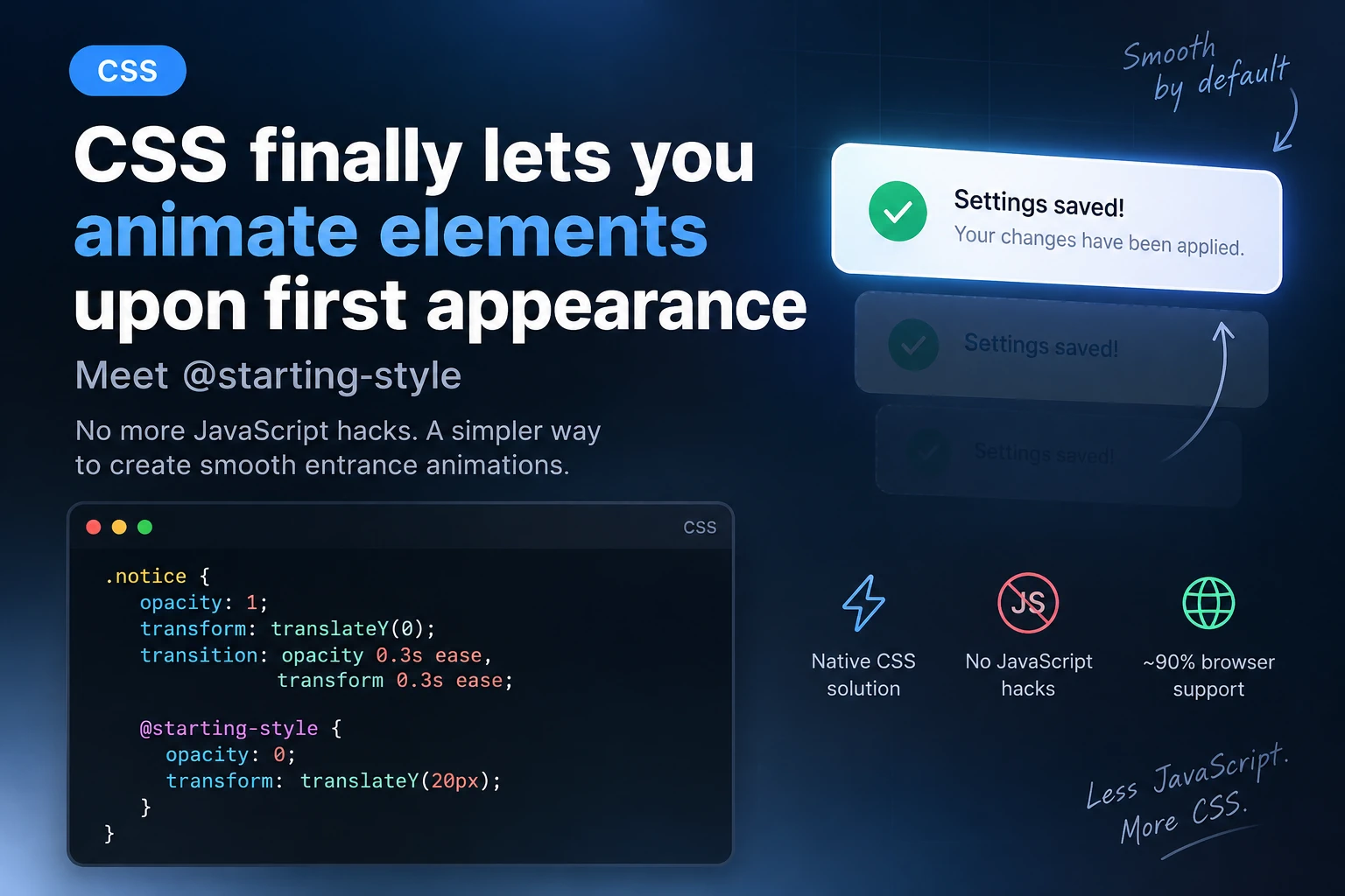
CSS Can Finally Animate an Element’s First Appearance: Meet @starting-style
CSS has had transition for a long time, but there was one annoying limitation: transitions did not work properly when an element appeared for the first time.
For example, when we added a notification, modal window, product card, or another element to the DOM using JavaScript, the browser immediately displayed it in its final state.
To create a smooth entrance animation, developers had to use extra classes, requestAnimationFrame(), setTimeout(), or other JavaScript workarounds.
Now this can be done much more easily.
CSS has a new rule for this:
@starting-style
It allows us to define the initial state of an element before it first appears, after which a regular transition smoothly moves it to the final state.
And most importantly, this is no longer just an experimental feature. @starting-style is part of Baseline 2024 and already has broad support across modern browsers.
What Problem Does @starting-style Solve?
Let’s look at a simple example.
We have an element:
<div class="notice">
    Settings saved successfully
</div>
And we want it to smoothly slide up when it appears:
.notice {
    opacity: 1;
    transform: translateY(0);

    transition:
        opacity 0.3s ease,
        transform 0.3s ease;
}
You might expect the browser to automatically animate it from some initial state.
But there is a problem: when the element appears for the first time, it has no previous state.
The browser immediately sees:
opacity: 1;
transform: translateY(0);
So there is effectively nothing to transition from.
This is exactly what @starting-style solves.
The Simplest @starting-style Example
Let’s add an initial state:
.notice {
    opacity: 1;
    transform: translateY(0);

    transition:
        opacity 0.3s ease,
        transform 0.3s ease;
}

@starting-style {
    .notice {
        opacity: 0;
        transform: translateY(20px);
    }
}
Now, when .notice appears for the first time, the browser effectively sees:
Starting state
opacity: 0
translateY(20px)

        ↓ transition

Final state
opacity: 1
translateY(0)
And all of this works without JavaScript code responsible for starting the animation.
JavaScript can still add the element to the DOM, but it no longer needs to create an intermediate state manually.
Nested Syntax
There is another way to write it.
@starting-style can be nested directly inside the CSS selector:
.notice {
    opacity: 1;
    transform: translateY(0);

    transition:
        opacity 0.3s ease,
        transform 0.3s ease;

    @starting-style {
        opacity: 0;
        transform: translateY(20px);
    }
}
Personally, I find this version easier to read.
Everything is in one place:
- final state;
- transition;
- starting state.
This is especially convenient for component-based CSS.
How We Used to Do It
Before @starting-style, the typical approach looked something like this.
CSS:
.notice {
    opacity: 0;
    transform: translateY(20px);

    transition:
        opacity 0.3s ease,
        transform 0.3s ease;
}

.notice.is-visible {
    opacity: 1;
    transform: translateY(0);
}
JavaScript:
const notice = document.createElement('div');

notice.className = 'notice';
notice.textContent = 'Settings saved successfully';

document.body.appendChild(notice);

requestAnimationFrame(() => {
    notice.classList.add('is-visible');
});
Why was requestAnimationFrame() needed here?
Because the browser first had to render:
opacity: 0;
and only then receive:
opacity: 1;
Otherwise, both states could be applied during the same rendering cycle, and the transition would not run.
With @starting-style, this becomes much simpler.
JavaScript:
const notice = document.createElement('div');

notice.className = 'notice';
notice.textContent = 'Settings saved successfully';

document.body.appendChild(notice);
CSS:
.notice {
    opacity: 1;
    transform: translateY(0);

    transition:
        opacity 0.3s ease,
        transform 0.3s ease;

    @starting-style {
        opacity: 0;
        transform: translateY(20px);
    }
}
Done.
JavaScript handles the logic.
CSS handles the animation.
That is exactly how it should be.
Where Is This Actually Useful?
@starting-style is especially useful for elements that appear dynamically.
For example:
AJAX Notifications
.ajax-message {
    opacity: 1;
    transform: translateY(0);

    transition: 0.3s ease;

    @starting-style {
        opacity: 0;
        transform: translateY(-10px);
    }
}
These can be messages such as:
Product added to cart

Form submitted successfully

Settings saved

An error occurred
Toast Notifications
.toast {
    opacity: 1;
    transform: translateX(0);

    transition:
        opacity 0.25s ease,
        transform 0.25s ease;

    @starting-style {
        opacity: 0;
        transform: translateX(30px);
    }
}
When .toast is added to the DOM, it can now smoothly appear from the right.
Cards Added via AJAX
For example, WooCommerce may load products without reloading the page.
You can use:
.product-card {
    opacity: 1;
    transform: translateY(0) scale(1);

    transition:
        opacity 0.4s ease,
        transform 0.4s ease;

    @starting-style {
        opacity: 0;
        transform: translateY(15px) scale(0.98);
    }
}
As soon as a new element is added to the DOM, it gets a smooth entrance animation automatically.
No:
element.classList.add('animate');
No timers.
No requestAnimationFrame().
Popover API + @starting-style
Things become even more interesting when @starting-style is combined with the modern HTML Popover API.
HTML:
<button popovertarget="user-menu">
    Open menu
</button>

<div id="user-menu" popover>
    <a href="#">Profile</a>
    <a href="#">Settings</a>
    <a href="#">Log out</a>
</div>
CSS:
[popover]:popover-open {
    opacity: 1;
    transform: translateY(0) scale(1);

    transition:
        opacity 0.2s ease,
        transform 0.2s ease;

    @starting-style {
        opacity: 0;
        transform: translateY(-8px) scale(0.96);
    }
}
Now the popover can smoothly appear without JavaScript-based animation logic.
What About display: none?
This is where things get even more interesting.
Historically, display has been one of the most inconvenient properties to work with when using transitions.
For example:
.modal {
    display: none;
    opacity: 0;
}

.modal.active {
    display: block;
    opacity: 1;
}
You might expect opacity to transition smoothly, but because of display: none, the element effectively does not participate in layout.
Modern CSS is gradually solving this problem too.
You can use:
.modal {
    transition:
        opacity 0.3s,
        display 0.3s;

    transition-behavior: allow-discrete;
}
Combined with @starting-style, this makes it possible to build more complex entry and exit transitions with much less JavaScript.
For example:
.modal {
    display: none;
    opacity: 0;
    transform: scale(0.95);

    transition:
        opacity 0.3s,
        transform 0.3s,
        display 0.3s allow-discrete;
}

.modal.is-open {
    display: block;
    opacity: 1;
    transform: scale(1);

    @starting-style {
        opacity: 0;
        transform: scale(0.95);
    }
}
Here, @starting-style defines the state from which the entrance transition begins.
It is important to understand that @starting-style is designed specifically for CSS transitions. It is not required for regular @keyframes animations.
@starting-style Does Not Replace JavaScript
There is an important detail here.
It may seem like JavaScript is no longer needed for UI animations at all.
That is not the case.
@starting-style does not replace application logic.
JavaScript may still be needed to:
document.body.appendChild(element);
or:
modal.classList.add('is-open');
or to fetch data through AJAX.
But previously, JavaScript was often required just to technically trigger the animation:
element.classList.add('initial');

requestAnimationFrame(() => {
    element.classList.add('visible');
});
In many cases, this is exactly the code we can now remove.
A Good WordPress Example
Imagine a WordPress site with a custom AJAX form.
After the form is submitted successfully, we create a message:
const message = document.createElement('div');

message.className = 'form-success';
message.textContent = 'Thank you! Your message has been sent.';

form.appendChild(message);
CSS:
.form-success {
    padding: 16px 20px;
    border-radius: 10px;

    opacity: 1;
    transform: translateY(0);

    transition:
        opacity 0.35s ease,
        transform 0.35s ease;

    @starting-style {
        opacity: 0;
        transform: translateY(15px);
    }
}
JavaScript does not even need to know that the element is animated.
This gives us a clean separation of responsibilities:
JavaScript
↓
creates the element

CSS
↓
controls how it looks and appears
Another Example: WooCommerce Mini Cart
In WooCommerce, it is common to display a message after a product has been added to the cart.
For example:
.woocommerce-message {
    opacity: 1;
    transform: translateY(0);

    transition:
        opacity 0.3s ease,
        transform 0.3s ease;

    @starting-style {
        opacity: 0;
        transform: translateY(-15px);
    }
}
If the message is inserted into the DOM dynamically, the browser gets the starting state automatically.
For custom WooCommerce interfaces, this can remove a noticeable amount of helper JavaScript.
Which Properties Are Best to Animate?
As with any CSS transition, it is better to animate properties the browser can handle efficiently.
The most common choices are:
opacity
transform
For example:
@starting-style {
    .card {
        opacity: 0;
        transform: translateY(20px);
    }
}
Instead of unnecessarily animating:
width
height
top
left
margin
especially when many elements are involved.
For most UI entrance effects, combinations such as:
opacity + translate
or:
opacity + scale
are more than enough.
Don’t Forget prefers-reduced-motion
Modern CSS features do not remove the need to think about accessibility.
If the user has enabled reduced motion in their system settings, it is a good idea to respect that preference.
For example:
.card {
    opacity: 1;
    transform: translateY(0);

    transition:
        opacity 0.3s ease,
        transform 0.3s ease;

    @starting-style {
        opacity: 0;
        transform: translateY(20px);
    }
}

@media (prefers-reduced-motion: reduce) {
    .card {
        transition: none;
    }
}
This keeps the effect for most users while avoiding unnecessary motion for those who prefer reduced animations.
What Happens in Older Browsers?
This is one of the advantages of this approach.
A browser that does not understand:
@starting-style
will simply ignore the rule.
The element will still appear normally in its final state.
So instead of:
smooth appearance
the user will simply get:
regular appearance
The site functionality itself should continue to work.
This makes @starting-style a good example of progressive enhancement.
Browser Support
At this point, browser support is already strong enough for modern projects.
@starting-style works in current versions of major browsers, including:
Chrome
Edge
Firefox
Safari
Safari on iOS
Samsung Internet
That means it can already be used confidently in many production projects, especially as progressive enhancement.
Important: @starting-style Is Not @keyframes
Do not confuse:
@starting-style
with:
@keyframes
For example:
.element {
    animation: fade-in 0.3s ease;
}

@keyframes fade-in {
    from {
        opacity: 0;
    }

    to {
        opacity: 1;
    }
}
and:
.element {
    opacity: 1;
    transition: opacity 0.3s ease;

    @starting-style {
        opacity: 0;
    }
}
may look similar visually.
But conceptually, they work differently.
animation starts a separate CSS animation.
@starting-style provides the initial state for a regular transition when the element does not yet have a previous rendered state.
That is exactly why it is so useful for modern UI components.
Conclusion
@starting-style is a relatively small addition to CSS, but it solves a problem frontend developers have dealt with for years.
Instead of writing code like:
element.classList.add('start');

requestAnimationFrame(() => {
    element.classList.add('visible');
});
in many cases, this is now enough:
.element {
    opacity: 1;
    transform: translateY(0);

    transition:
        opacity 0.3s ease,
        transform 0.3s ease;

    @starting-style {
        opacity: 0;
        transform: translateY(20px);
    }
}
This is especially useful for:
- modal windows;
- popovers;
- toast notifications;
- AJAX content;
- forms;
- WooCommerce messages;
- mini carts;
- dynamically loaded Gutenberg components;
- elements added to the DOM after page load.
@starting-style is another great example of modern CSS taking over tasks that previously required JavaScript.
Less JavaScript. More CSS.