 uk
uk 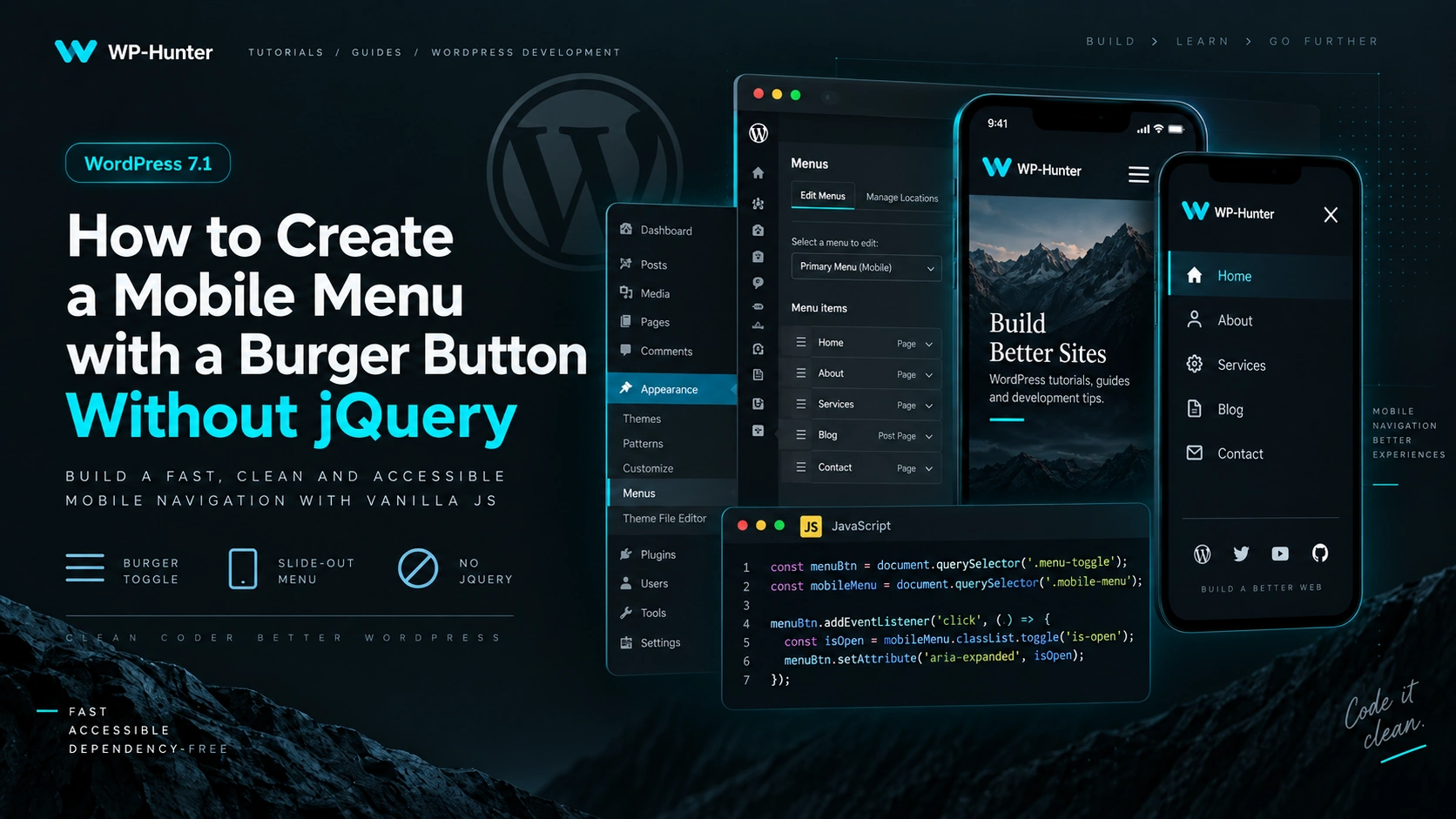
You do not need jQuery or any third-party JavaScript library to build a mobile menu in WordPress.
Modern Vanilla JavaScript is more than enough to implement:
- menu opening and closing;
- burger button animation;
- page scroll locking;
- closing the menu with the
Escapekey; - closing the menu after clicking a link;
- proper
aria-*attributes for accessibility.
In this article, we will build a simple mobile menu for a custom WordPress theme.
1. Output the Menu in header.php
Let’s assume that a menu location has already been registered in functions.php:
function wp_hunter_setup() {

	register_nav_menus(
		array(
			'primary' => __( 'Primary Menu', 'wp-hunter' ),
		)
	);

}
add_action( 'after_setup_theme', 'wp_hunter_setup' );
Now, in header.php, we will check whether a menu is assigned and add a burger button:
<?php if ( has_nav_menu( 'primary' ) ) : ?>

	<button
		class="menu-toggle"
		type="button"
		aria-expanded="false"
		aria-controls="primary-navigation"
		aria-label="<?php esc_attr_e( 'Open menu', 'wp-hunter' ); ?>"
	>
		<span class="menu-toggle__line"></span>
		<span class="menu-toggle__line"></span>
		<span class="menu-toggle__line"></span>
	</button>

	<nav
		id="primary-navigation"
		class="primary-navigation"
		aria-label="<?php esc_attr_e( 'Primary Navigation', 'wp-hunter' ); ?>"
	>
		<?php
		wp_nav_menu(
			array(
				'theme_location' => 'primary',
				'container'      => false,
				'menu_class'     => 'primary-menu',
				'fallback_cb'    => false,
			)
		);
		?>
	</nav>

<?php endif; ?>
Two attributes are especially important here:
aria-expanded="false"
This indicates whether the menu is currently open.
And:
aria-controls="primary-navigation"
This tells assistive technologies which element the button controls.
The corresponding navigation element has:
id="primary-navigation"
2. Create the Burger Button
Inside the button, we use three regular <span> elements:
<span class="menu-toggle__line"></span>
<span class="menu-toggle__line"></span>
<span class="menu-toggle__line"></span>
We will turn them into a burger icon using CSS:
.menu-toggle {
	display: none;
	width: 44px;
	height: 44px;
	padding: 10px;
	border: 0;
	background: transparent;
	cursor: pointer;
}

.menu-toggle__line {
	display: block;
	width: 24px;
	height: 2px;
	margin: 5px auto;
	background: currentColor;
	transition:
		transform 0.3s ease,
		opacity 0.3s ease;
}
On desktop, the button is hidden:
display: none;
We will display it only on smaller screens.
3. Animate the Burger into a Close Icon
When the menu opens, JavaScript will change:
aria-expanded="false"
to:
aria-expanded="true"
This allows us to control the animation without adding another CSS class:
.menu-toggle[aria-expanded="true"] .menu-toggle__line:nth-child(1) {
	transform: translateY(7px) rotate(45deg);
}

.menu-toggle[aria-expanded="true"] .menu-toggle__line:nth-child(2) {
	opacity: 0;
}

.menu-toggle[aria-expanded="true"] .menu-toggle__line:nth-child(3) {
	transform: translateY(-7px) rotate(-45deg);
}
The three burger lines will smoothly transform into a close icon.
4. Mobile Menu Styles
Now let’s create the mobile navigation itself.
For example, we can make it slide in from the right:
@media (max-width: 991px) {

	.menu-toggle {
		display: block;
		position: relative;
		z-index: 1001;
	}

	.primary-navigation {
		position: fixed;
		top: 0;
		right: 0;
		bottom: 0;
		width: min(400px, 100%);
		padding: 100px 30px 40px;
		background: #fff;

		transform: translateX(100%);
		visibility: hidden;
		transition:
			transform 0.35s ease,
			visibility 0.35s;
		z-index: 1000;
	}

	body.menu-open .primary-navigation {
		transform: translateX(0);
		visibility: visible;
	}

	.primary-menu {
		display: flex;
		flex-direction: column;
		gap: 20px;
		margin: 0;
		padding: 0;
		list-style: none;
	}

	.primary-menu a {
		display: block;
		text-decoration: none;
	}

	body.menu-open {
		overflow: hidden;
	}
}
The key selector here is:
body.menu-open
When this class appears on the <body> element, the menu becomes visible.
Also:
body.menu-open {
	overflow: hidden;
}
prevents the page behind the menu from scrolling.
5. JavaScript Without jQuery
Create a file:
/assets/js/navigation.js
and add:
document.addEventListener('DOMContentLoaded', () => {

	const toggle = document.querySelector('.menu-toggle');
	const navigation = document.querySelector('.primary-navigation');

	if (!toggle || !navigation) {
		return;
	}

	const openMenu = () => {
		document.body.classList.add('menu-open');

		toggle.setAttribute('aria-expanded', 'true');
		toggle.setAttribute('aria-label', 'Close menu');
	};

	const closeMenu = () => {
		document.body.classList.remove('menu-open');

		toggle.setAttribute('aria-expanded', 'false');
		toggle.setAttribute('aria-label', 'Open menu');
	};

	const toggleMenu = () => {
		const isOpen = toggle.getAttribute('aria-expanded') === 'true';

		if (isOpen) {
			closeMenu();
		} else {
			openMenu();
		}
	};

	toggle.addEventListener('click', toggleMenu);

});
That is enough for the basic version.
No jQuery, Bootstrap, or additional dependency is required.
6. Close the Menu with Escape
It is a good idea to allow users to close the menu using the Escape key.
This is especially useful for keyboard navigation.
Add:
document.addEventListener('keydown', (event) => {

	if (event.key === 'Escape') {
		closeMenu();
	}

});
Now pressing:
Esc
will close the mobile menu.
7. Close the Menu After Clicking a Link
On mobile devices, the menu should usually close after the user selects a navigation link.
Add:
navigation.addEventListener('click', (event) => {

	if (event.target.closest('a')) {
		closeMenu();
	}

});
This is especially useful when the navigation includes anchor links such as:
#about
#services
#contacts
The user clicks a link, the menu closes, and the browser scrolls to the required section.
8. Close the Menu When Clicking Outside
You can also close the navigation when the user clicks anywhere outside it.
document.addEventListener('click', (event) => {

	const clickedInsideMenu = navigation.contains(event.target);
	const clickedToggle = toggle.contains(event.target);

	if (!clickedInsideMenu && !clickedToggle) {
		closeMenu();
	}

});
Clicks inside the navigation or on the burger button will not trigger the closing logic.
9. Handle Browser Resize
There is one more small detail worth handling.
For example, a user may open the mobile menu and then resize the browser to desktop width.
The <body> element may still contain:
class="menu-open"
To avoid keeping the mobile state active, reset the menu when the viewport switches to desktop:
const desktopMedia = window.matchMedia('(min-width: 992px)');

desktopMedia.addEventListener('change', (event) => {

	if (event.matches) {
		closeMenu();
	}

});
Now, when the viewport becomes wider than 992px, the mobile menu will automatically return to its default state.
10. Complete JavaScript
The final navigation.js file will look like this:
document.addEventListener('DOMContentLoaded', () => {

	const toggle = document.querySelector('.menu-toggle');
	const navigation = document.querySelector('.primary-navigation');

	if (!toggle || !navigation) {
		return;
	}

	const openMenu = () => {
		document.body.classList.add('menu-open');

		toggle.setAttribute('aria-expanded', 'true');
		toggle.setAttribute('aria-label', 'Close menu');
	};

	const closeMenu = () => {
		document.body.classList.remove('menu-open');

		toggle.setAttribute('aria-expanded', 'false');
		toggle.setAttribute('aria-label', 'Open menu');
	};

	const toggleMenu = () => {
		const isOpen = toggle.getAttribute('aria-expanded') === 'true';

		isOpen ? closeMenu() : openMenu();
	};

	toggle.addEventListener('click', toggleMenu);

	document.addEventListener('keydown', (event) => {

		if (event.key === 'Escape') {
			closeMenu();
		}

	});

	navigation.addEventListener('click', (event) => {

		if (event.target.closest('a')) {
			closeMenu();
		}

	});

	document.addEventListener('click', (event) => {

		const clickedInsideMenu = navigation.contains(event.target);
		const clickedToggle = toggle.contains(event.target);

		if (!clickedInsideMenu && !clickedToggle) {
			closeMenu();
		}

	});

	const desktopMedia = window.matchMedia('(min-width: 992px)');

	desktopMedia.addEventListener('change', (event) => {

		if (event.matches) {
			closeMenu();
		}

	});

});
For a standard mobile navigation, this is more than enough.
11. Enqueue JavaScript in WordPress
You should not add:
<script src="..."></script>
directly inside header.php or footer.php.
WordPress has its own script-loading API — wp_enqueue_script().
Add the following code to functions.php:
function wp_hunter_scripts() {

	wp_enqueue_script(
		'wp-hunter-navigation',
		get_template_directory_uri() . '/assets/js/navigation.js',
		array(),
		wp_get_theme()->get( 'Version' ),
		array(
			'strategy'  => 'defer',
			'in_footer' => true,
		)
	);

}
add_action( 'wp_enqueue_scripts', 'wp_hunter_scripts' );
Our script does not depend on jQuery, so the dependencies array is empty:
array()
This means WordPress will not load jQuery just to make the mobile menu work.
12. Complete Theme Structure
The theme structure may look like this:
your-theme/
│
├── assets/
│   ├── css/
│   │   └── main.css
│   │
│   └── js/
│       └── navigation.js
│
├── functions.php
├── header.php
├── footer.php
├── index.php
└── style.css
In functions.php:
register_nav_menus();
registers the menu location.
In header.php:
wp_nav_menu();
outputs the navigation and burger button.
The:
navigation.js
file controls opening and closing behavior.
And CSS handles the layout and animation.
Why Use Vanilla JavaScript Instead of jQuery?
In the past, code like this was commonly used:
$('.menu-toggle').on('click', function() {
	$('.menu').toggleClass('active');
});
But for such a simple interaction, jQuery is no longer necessary.
Vanilla JavaScript already provides everything we need:
document.querySelector()
addEventListener()
classList.add()
classList.remove()
classList.toggle()
closest()
matchMedia()
As a result, we avoid an unnecessary dependency and keep the theme code simpler.
Do Not Forget About Accessibility
The burger control should be a real:
<button>
instead of:
<div>
or:
<span>
A button already has the correct semantics and works properly with keyboard navigation.
We also use:
aria-expanded="false"
to indicate the current menu state.
When the menu opens:
aria-expanded="true"
And with:
aria-controls="primary-navigation"
we connect the button directly to the navigation element it controls.
Conclusion
You do not need jQuery to create a modern mobile menu in WordPress.
A simple combination is enough:
wp_nav_menu()
+
CSS
+
Vanilla JavaScript
In our example, the burger button:
- opens and closes the menu;
- animates into a close icon;
- updates
aria-expanded; - prevents background scrolling;
- closes with
Escape; - closes after clicking a navigation link;
- closes when clicking outside the menu;
- automatically resets when switching back to desktop.
For most custom WordPress themes, this is enough to create a clean, lightweight, and dependency-free mobile navigation.