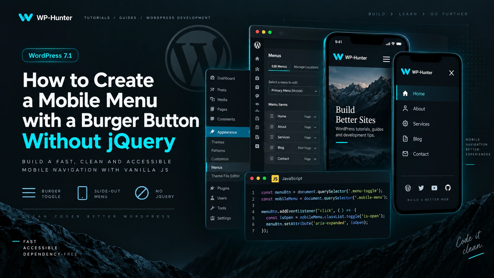
How to Create a Mobile Menu with a Burger Button Without jQuery

You do not need jQuery or any third-party JavaScript library to build a mobile menu in WordPress.

Modern Vanilla JavaScript is more than enough to implement:

  • menu opening and closing;
  • burger button animation;
  • page scroll locking;
  • closing the menu with the Escape key;
  • closing the menu after clicking a link;
  • proper aria-* attributes for accessibility.

In this article, we will build a simple mobile menu for a custom WordPress theme.

1. Output the Menu in header.php

Let’s assume that a menu location has already been registered in functions.php:

function wp_hunter_setup() {

	register_nav_menus(
		array(
			'primary' => __( 'Primary Menu', 'wp-hunter' ),
		)
	);

}
add_action( 'after_setup_theme', 'wp_hunter_setup' );

Now, in header.php, we will check whether a menu is assigned and add a burger button:

<?php if ( has_nav_menu( 'primary' ) ) : ?>

	<button
		class="menu-toggle"
		type="button"
		aria-expanded="false"
		aria-controls="primary-navigation"
		aria-label="<?php esc_attr_e( 'Open menu', 'wp-hunter' ); ?>"
	>
		<span class="menu-toggle__line"></span>
		<span class="menu-toggle__line"></span>
		<span class="menu-toggle__line"></span>
	</button>

	<nav
		id="primary-navigation"
		class="primary-navigation"
		aria-label="<?php esc_attr_e( 'Primary Navigation', 'wp-hunter' ); ?>"
	>
		<?php
		wp_nav_menu(
			array(
				'theme_location' => 'primary',
				'container'      => false,
				'menu_class'     => 'primary-menu',
				'fallback_cb'    => false,
			)
		);
		?>
	</nav>

<?php endif; ?>

Two attributes are especially important here:

aria-expanded="false"

This indicates whether the menu is currently open.

And:

aria-controls="primary-navigation"

This tells assistive technologies which element the button controls.

The corresponding navigation element has:

id="primary-navigation"

2. Create the Burger Button

Inside the button, we use three regular <span> elements:

<span class="menu-toggle__line"></span>

We will turn them into a burger icon using CSS:

.menu-toggle {
	display: none;
	width: 44px;
	height: 44px;
	padding: 10px;
	border: 0;
	background: transparent;
	cursor: pointer;
}

.menu-toggle__line {
	display: block;
	width: 24px;
	height: 2px;
	margin: 5px auto;
	background: currentColor;
	transition:
		transform 0.3s ease,
		opacity 0.3s ease;
}

On desktop, the button is hidden:

display: none;

We will display it only on smaller screens.

3. Animate the Burger into a Close Icon

When the menu opens, JavaScript will change:

aria-expanded="false"

to:

aria-expanded="true"

This allows us to control the animation without adding another CSS class:

.menu-toggle[aria-expanded="true"] .menu-toggle__line:nth-child(1) {
	transform: translateY(7px) rotate(45deg);
}

.menu-toggle[aria-expanded="true"] .menu-toggle__line:nth-child(2) {
	opacity: 0;
}

.menu-toggle[aria-expanded="true"] .menu-toggle__line:nth-child(3) {
	transform: translateY(-7px) rotate(-45deg);
}

The three burger lines will smoothly transform into a close icon.

4. Mobile Menu Styles

Now let’s create the mobile navigation itself.

For example, we can make it slide in from the right:

@media (max-width: 991px) {

	.menu-toggle {
		display: block;
		position: relative;
		z-index: 1001;
	}

	.primary-navigation {
		position: fixed;
		top: 0;
		right: 0;
		bottom: 0;
		width: min(400px, 100%);
		padding: 100px 30px 40px;
		background: #fff;

		transform: translateX(100%);
		visibility: hidden;
		transition:
			transform 0.35s ease,
			visibility 0.35s;
		z-index: 1000;
	}

	body.menu-open .primary-navigation {
		transform: translateX(0);
		visibility: visible;
	}

	.primary-menu {
		display: flex;
		flex-direction: column;
		gap: 20px;
		margin: 0;
		padding: 0;
		list-style: none;
	}

	.primary-menu a {
		display: block;
		text-decoration: none;
	}

	body.menu-open {
		overflow: hidden;
	}
}

The key selector here is:

body.menu-open

When this class appears on the <body> element, the menu becomes visible.

Also:

body.menu-open {
	overflow: hidden;
}

prevents the page behind the menu from scrolling.

5. JavaScript Without jQuery

Create a file:

/assets/js/navigation.js

and add:

document.addEventListener('DOMContentLoaded', () => {

	const toggle = document.querySelector('.menu-toggle');
	const navigation = document.querySelector('.primary-navigation');

	if (!toggle || !navigation) {
		return;
	}

	const openMenu = () => {
		document.body.classList.add('menu-open');

		toggle.setAttribute('aria-expanded', 'true');
		toggle.setAttribute('aria-label', 'Close menu');
	};

	const closeMenu = () => {
		document.body.classList.remove('menu-open');

		toggle.setAttribute('aria-expanded', 'false');
		toggle.setAttribute('aria-label', 'Open menu');
	};

	const toggleMenu = () => {
		const isOpen = toggle.getAttribute('aria-expanded') === 'true';

		if (isOpen) {
			closeMenu();
		} else {
			openMenu();
		}
	};

	toggle.addEventListener('click', toggleMenu);

});

That is enough for the basic version.

No jQuery, Bootstrap, or additional dependency is required.

6. Close the Menu with Escape

It is a good idea to allow users to close the menu using the Escape key.

This is especially useful for keyboard navigation.

Add:

document.addEventListener('keydown', (event) => {

	if (event.key === 'Escape') {
		closeMenu();
	}

});

Now pressing:

Esc

will close the mobile menu.

On mobile devices, the menu should usually close after the user selects a navigation link.

Add:

navigation.addEventListener('click', (event) => {

	if (event.target.closest('a')) {
		closeMenu();
	}

});

This is especially useful when the navigation includes anchor links such as:

#about
#services
#contacts

The user clicks a link, the menu closes, and the browser scrolls to the required section.

8. Close the Menu When Clicking Outside

You can also close the navigation when the user clicks anywhere outside it.

document.addEventListener('click', (event) => {

	const clickedInsideMenu = navigation.contains(event.target);
	const clickedToggle = toggle.contains(event.target);

	if (!clickedInsideMenu && !clickedToggle) {
		closeMenu();
	}

});

Clicks inside the navigation or on the burger button will not trigger the closing logic.

9. Handle Browser Resize

There is one more small detail worth handling.

For example, a user may open the mobile menu and then resize the browser to desktop width.

The <body> element may still contain:

class="menu-open"

To avoid keeping the mobile state active, reset the menu when the viewport switches to desktop:

const desktopMedia = window.matchMedia('(min-width: 992px)');

desktopMedia.addEventListener('change', (event) => {

	if (event.matches) {
		closeMenu();
	}

});

Now, when the viewport becomes wider than 992px, the mobile menu will automatically return to its default state.

10. Complete JavaScript

The final navigation.js file will look like this:

document.addEventListener('DOMContentLoaded', () => {

	const toggle = document.querySelector('.menu-toggle');
	const navigation = document.querySelector('.primary-navigation');

	if (!toggle || !navigation) {
		return;
	}

	const openMenu = () => {
		document.body.classList.add('menu-open');

		toggle.setAttribute('aria-expanded', 'true');
		toggle.setAttribute('aria-label', 'Close menu');
	};

	const closeMenu = () => {
		document.body.classList.remove('menu-open');

		toggle.setAttribute('aria-expanded', 'false');
		toggle.setAttribute('aria-label', 'Open menu');
	};

	const toggleMenu = () => {
		const isOpen = toggle.getAttribute('aria-expanded') === 'true';

		isOpen ? closeMenu() : openMenu();
	};

	toggle.addEventListener('click', toggleMenu);

	document.addEventListener('keydown', (event) => {

		if (event.key === 'Escape') {
			closeMenu();
		}

	});

	navigation.addEventListener('click', (event) => {

		if (event.target.closest('a')) {
			closeMenu();
		}

	});

	document.addEventListener('click', (event) => {

		const clickedInsideMenu = navigation.contains(event.target);
		const clickedToggle = toggle.contains(event.target);

		if (!clickedInsideMenu && !clickedToggle) {
			closeMenu();
		}

	});

	const desktopMedia = window.matchMedia('(min-width: 992px)');

	desktopMedia.addEventListener('change', (event) => {

		if (event.matches) {
			closeMenu();
		}

	});

});

For a standard mobile navigation, this is more than enough.

11. Enqueue JavaScript in WordPress

You should not add:

<script src="..."></script>

directly inside header.php or footer.php.

WordPress has its own script-loading API — wp_enqueue_script().

Add the following code to functions.php:

function wp_hunter_scripts() {

	wp_enqueue_script(
		'wp-hunter-navigation',
		get_template_directory_uri() . '/assets/js/navigation.js',
		array(),
		wp_get_theme()->get( 'Version' ),
		array(
			'strategy'  => 'defer',
			'in_footer' => true,
		)
	);

}
add_action( 'wp_enqueue_scripts', 'wp_hunter_scripts' );

Our script does not depend on jQuery, so the dependencies array is empty:

array()

This means WordPress will not load jQuery just to make the mobile menu work.

12. Complete Theme Structure

The theme structure may look like this:

your-theme/
│
├── assets/
│   ├── css/
│   │   └── main.css
│   │
│   └── js/
│       └── navigation.js
│
├── functions.php
├── header.php
├── footer.php
├── index.php
└── style.css

In functions.php:

register_nav_menus();

registers the menu location.

In header.php:

wp_nav_menu();

outputs the navigation and burger button.

The:

navigation.js

file controls opening and closing behavior.

And CSS handles the layout and animation.

Why Use Vanilla JavaScript Instead of jQuery?

In the past, code like this was commonly used:

$('.menu-toggle').on('click', function() {
	$('.menu').toggleClass('active');
});

But for such a simple interaction, jQuery is no longer necessary.

Vanilla JavaScript already provides everything we need:

document.querySelector()
addEventListener()
classList.add()
classList.remove()
classList.toggle()
closest()
matchMedia()

As a result, we avoid an unnecessary dependency and keep the theme code simpler.

Do Not Forget About Accessibility

The burger control should be a real:

<button>

instead of:

<div>

or:

<span>

A button already has the correct semantics and works properly with keyboard navigation.

We also use:

aria-expanded="false"

to indicate the current menu state.

When the menu opens:

aria-expanded="true"

And with:

aria-controls="primary-navigation"

we connect the button directly to the navigation element it controls.

Conclusion

You do not need jQuery to create a modern mobile menu in WordPress.

A simple combination is enough:

wp_nav_menu()
+
CSS
+
Vanilla JavaScript

In our example, the burger button:

  • opens and closes the menu;
  • animates into a close icon;
  • updates aria-expanded;
  • prevents background scrolling;
  • closes with Escape;
  • closes after clicking a navigation link;
  • closes when clicking outside the menu;
  • automatically resets when switching back to desktop.

For most custom WordPress themes, this is enough to create a clean, lightweight, and dependency-free mobile navigation.
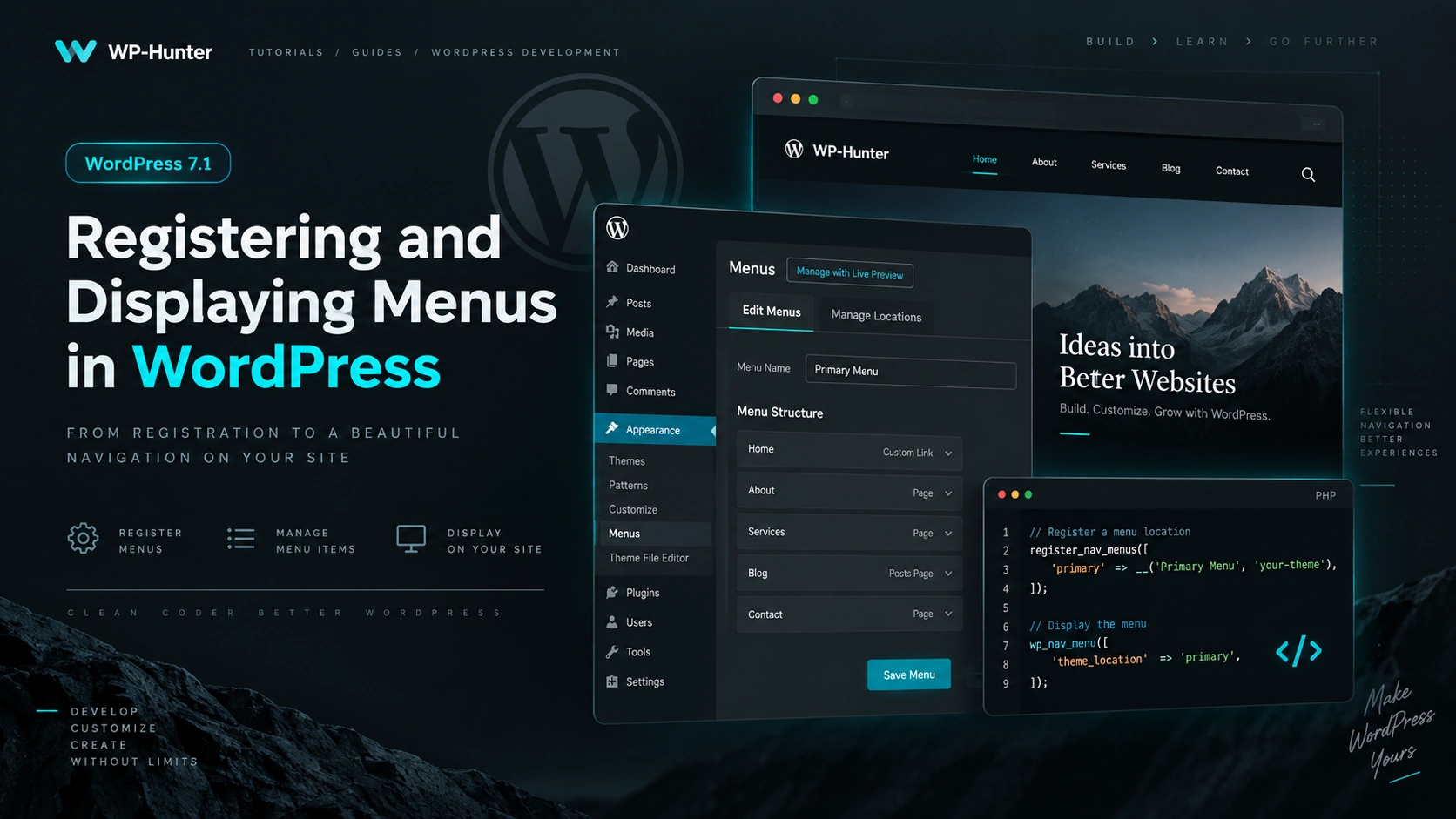
Registering and Displaying Menus in WordPress

Navigation menus are one of the basic elements of any WordPress theme. If you are developing your own classic or hybrid theme, the most convenient approach is to register separate menu locations and display them in the required template areas.

In this article, we will look at how to properly register and display menus in WordPress 7.1.

Registering Menus in WordPress

To create menu locations, WordPress provides the following function:

register_nav_menus();

For example, let’s create two menu locations:

  • primary menu in the header;
  • footer menu.

Add the following code to your theme’s functions.php file:

function wp_hunter_setup() {

	register_nav_menus(
		array(
			'primary' => __( 'Primary Menu', 'wp-hunter' ),
			'footer'  => __( 'Footer Menu', 'wp-hunter' ),
		)
	);

}
add_action( 'after_setup_theme', 'wp_hunter_setup' );

WordPress will now recognize two menu locations:

primary
footer

primary and footer are internal location identifiers. We will use them later when displaying menus inside theme templates.

The register_nav_menus() function automatically enables menu support for the theme, so you do not need to additionally call:

add_theme_support( 'menus' );

Registering a Single Menu

If you only need one menu location, you can use:

register_nav_menu();

For example:

function wp_hunter_setup() {

	register_nav_menu(
		'primary',
		__( 'Primary Menu', 'wp-hunter' )
	);

}
add_action( 'after_setup_theme', 'wp_hunter_setup' );

However, if your theme uses multiple menu locations, register_nav_menus() is usually more convenient.

Displaying a Menu in the Theme

To display a registered menu, use:

wp_nav_menu();

For example, inside header.php:

<?php
wp_nav_menu(
	array(
		'theme_location' => 'primary',
	)
);
?>

The following parameter:

'theme_location' => 'primary'

tells WordPress which registered menu location should be displayed.

Customizing the Menu HTML

In a real project, you will usually want to control the menu wrapper, classes, and generated HTML.

For example:

<?php
wp_nav_menu(
	array(
		'theme_location'  => 'primary',
		'container'       => 'nav',
		'container_class' => 'header-nav',
		'menu_class'      => 'header-menu',
		'menu_id'         => 'header-menu',
		'fallback_cb'     => false,
	)
);
?>

The generated markup will look roughly like this:

<nav class="header-nav">
	<ul id="header-menu" class="header-menu">
		<li class="menu-item">
			<a href="/">Home</a>
		</li>

		<li class="menu-item">
			<a href="/blog/">Blog</a>
		</li>
	</ul>
</nav>

The main parameters are:

'theme_location'

Defines which registered menu location should be used.

'container'

Defines the HTML element that wraps the menu.

'container_class'

Adds a class to the wrapper element.

'menu_class'

Sets the class for the <ul> element.

'menu_id'

Sets the menu id.

And:

'fallback_cb' => false

prevents WordPress from automatically displaying another menu or a list of pages if no menu has been assigned to this location.

Checking Whether a Menu Is Assigned

Before displaying a menu, you can check whether a menu has actually been assigned to the required location.

For this, WordPress provides:

has_nav_menu();

Example:

<?php if ( has_nav_menu( 'primary' ) ) : ?>

	<nav class="header-nav">

		<?php
		wp_nav_menu(
			array(
				'theme_location' => 'primary',
				'container'      => false,
				'menu_class'     => 'header-menu',
				'fallback_cb'    => false,
			)
		);
		?>

	</nav>

<?php endif; ?>

This approach is especially useful if you do not want an empty <nav> element to appear when no menu is assigned.

The second menu location works in exactly the same way.

For example, inside footer.php:

<?php
wp_nav_menu(
	array(
		'theme_location' => 'footer',
		'container'      => 'nav',
		'menu_class'     => 'footer-menu',
		'fallback_cb'    => false,
	)
);
?>

This allows you to use one menu in the website header and another one in the footer.

By default, WordPress adds many useful classes to <li> elements, but sometimes you may want to add your own class directly to the <a> elements.

For example:

function wp_hunter_menu_link_attributes( $atts, $menu_item, $args ) {

	if ( isset( $args->theme_location ) && 'primary' === $args->theme_location ) {
		$atts['class'] = 'header-menu__link';
	}

	return $atts;
}
add_filter( 'nav_menu_link_attributes', 'wp_hunter_menu_link_attributes', 10, 3 );

Now the links in the primary menu will look like this:

<a class="header-menu__link" href="/">
	Home
</a>

This makes menu styling much easier.

Styling the Active Menu Item

WordPress automatically adds special classes to active menu items:

current-menu-item
current-menu-parent
current-menu-ancestor

This means the current menu item can be styled with regular CSS:

.header-menu .current-menu-item > a {
	font-weight: 600;
}

For example, you can add an underline:

.header-menu .current-menu-item > a {
	text-decoration: underline;
	text-underline-offset: 6px;
}

In most cases, no additional PHP logic is required to determine the active page.

Complete Example

In functions.php:

function wp_hunter_setup() {

	register_nav_menus(
		array(
			'primary' => __( 'Primary Menu', 'wp-hunter' ),
			'footer'  => __( 'Footer Menu', 'wp-hunter' ),
		)
	);

}
add_action( 'after_setup_theme', 'wp_hunter_setup' );

In header.php:

<?php if ( has_nav_menu( 'primary' ) ) : ?>

	<nav class="header-nav" aria-label="<?php esc_attr_e( 'Primary Navigation', 'wp-hunter' ); ?>">

		<?php
		wp_nav_menu(
			array(
				'theme_location' => 'primary',
				'container'      => false,
				'menu_class'     => 'header-menu',
				'fallback_cb'    => false,
			)
		);
		?>

	</nav>

<?php endif; ?>

And in footer.php:

<?php
wp_nav_menu(
	array(
		'theme_location' => 'footer',
		'container'      => false,
		'menu_class'     => 'footer-menu',
		'fallback_cb'    => false,
	)
);
?>

This is enough to implement a standard menu system in a custom WordPress theme.

What About Block Themes?

It is important to distinguish between classic and block-based WordPress themes.

For classic themes, the standard approach is:

register_nav_menus()

combined with:

wp_nav_menu()

In full Block Themes, navigation is usually built with the Navigation block (core/navigation) inside the Site Editor, so manually registering menu locations with PHP is generally unnecessary.

However, if you are developing your own classic or hybrid theme with header.php, footer.php, and PHP templates, register_nav_menus() and wp_nav_menu() remain a simple and convenient solution.

Conclusion

For menu management in a classic WordPress theme, you mainly need two functions:

register_nav_menus();

— registers menu locations;

wp_nav_menu();

— displays the menu in the required template location.

The connection between them is made through:

theme_location

For example:

'primary'

is registered in functions.php and then passed to wp_nav_menu() when displaying the menu.

This approach allows WordPress to manage the navigation structure while giving the theme developer full control over the markup, CSS, and display logic.

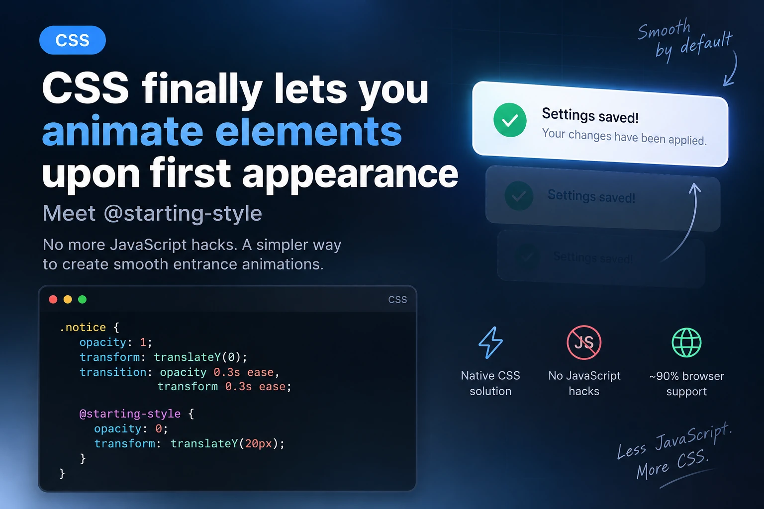
CSS @starting-style: Animating an Element’s First Appearance Without JavaScript.

CSS Can Finally Animate an Element’s First Appearance: Meet @starting-style

CSS has had transition for a long time, but there was one annoying limitation: transitions did not work properly when an element appeared for the first time.

For example, when we added a notification, modal window, product card, or another element to the DOM using JavaScript, the browser immediately displayed it in its final state.

To create a smooth entrance animation, developers had to use extra classes, requestAnimationFrame(), setTimeout(), or other JavaScript workarounds.

Now this can be done much more easily.

CSS has a new rule for this:

@starting-style

It allows us to define the initial state of an element before it first appears, after which a regular transition smoothly moves it to the final state.

And most importantly, this is no longer just an experimental feature. @starting-style is part of Baseline 2024 and already has broad support across modern browsers.


What Problem Does @starting-style Solve?

Let’s look at a simple example.

We have an element:

<div class="notice">
    Settings saved successfully
</div>

And we want it to smoothly slide up when it appears:

.notice {
    opacity: 1;
    transform: translateY(0);

    transition:
        opacity 0.3s ease,
        transform 0.3s ease;
}

You might expect the browser to automatically animate it from some initial state.

But there is a problem: when the element appears for the first time, it has no previous state.

The browser immediately sees:

opacity: 1;
transform: translateY(0);

So there is effectively nothing to transition from.

This is exactly what @starting-style solves.


The Simplest @starting-style Example

Let’s add an initial state:

.notice {
    opacity: 1;
    transform: translateY(0);

    transition:
        opacity 0.3s ease,
        transform 0.3s ease;
}

@starting-style {
    .notice {
        opacity: 0;
        transform: translateY(20px);
    }
}

Now, when .notice appears for the first time, the browser effectively sees:

Starting state
opacity: 0
translateY(20px)

        ↓ transition

Final state
opacity: 1
translateY(0)

And all of this works without JavaScript code responsible for starting the animation.

JavaScript can still add the element to the DOM, but it no longer needs to create an intermediate state manually.


Nested Syntax

There is another way to write it.

@starting-style can be nested directly inside the CSS selector:

.notice {
    opacity: 1;
    transform: translateY(0);

    transition:
        opacity 0.3s ease,
        transform 0.3s ease;

    @starting-style {
        opacity: 0;
        transform: translateY(20px);
    }
}

Personally, I find this version easier to read.

Everything is in one place:

  • final state;
  • transition;
  • starting state.

This is especially convenient for component-based CSS.


How We Used to Do It

Before @starting-style, the typical approach looked something like this.

CSS:

.notice {
    opacity: 0;
    transform: translateY(20px);

    transition:
        opacity 0.3s ease,
        transform 0.3s ease;
}

.notice.is-visible {
    opacity: 1;
    transform: translateY(0);
}

JavaScript:

const notice = document.createElement('div');

notice.className = 'notice';
notice.textContent = 'Settings saved successfully';

document.body.appendChild(notice);

requestAnimationFrame(() => {
    notice.classList.add('is-visible');
});

Why was requestAnimationFrame() needed here?

Because the browser first had to render:

opacity: 0;

and only then receive:

opacity: 1;

Otherwise, both states could be applied during the same rendering cycle, and the transition would not run.

With @starting-style, this becomes much simpler.

JavaScript:

const notice = document.createElement('div');

notice.className = 'notice';
notice.textContent = 'Settings saved successfully';

document.body.appendChild(notice);

CSS:

.notice {
    opacity: 1;
    transform: translateY(0);

    transition:
        opacity 0.3s ease,
        transform 0.3s ease;

    @starting-style {
        opacity: 0;
        transform: translateY(20px);
    }
}

Done.

JavaScript handles the logic.

CSS handles the animation.

That is exactly how it should be.


Where Is This Actually Useful?

@starting-style is especially useful for elements that appear dynamically.

For example:

AJAX Notifications

.ajax-message {
    opacity: 1;
    transform: translateY(0);

    transition: 0.3s ease;

    @starting-style {
        opacity: 0;
        transform: translateY(-10px);
    }
}

These can be messages such as:

Product added to cart

Form submitted successfully

Settings saved

An error occurred

Toast Notifications

.toast {
    opacity: 1;
    transform: translateX(0);

    transition:
        opacity 0.25s ease,
        transform 0.25s ease;

    @starting-style {
        opacity: 0;
        transform: translateX(30px);
    }
}

When .toast is added to the DOM, it can now smoothly appear from the right.


Cards Added via AJAX

For example, WooCommerce may load products without reloading the page.

You can use:

.product-card {
    opacity: 1;
    transform: translateY(0) scale(1);

    transition:
        opacity 0.4s ease,
        transform 0.4s ease;

    @starting-style {
        opacity: 0;
        transform: translateY(15px) scale(0.98);
    }
}

As soon as a new element is added to the DOM, it gets a smooth entrance animation automatically.

No:

element.classList.add('animate');

No timers.

No requestAnimationFrame().


Popover API + @starting-style

Things become even more interesting when @starting-style is combined with the modern HTML Popover API.

HTML:

<button popovertarget="user-menu">
    Open menu
</button>

<div id="user-menu" popover>
    <a href="#">Profile</a>
    <a href="#">Settings</a>
    <a href="#">Log out</a>
</div>

CSS:

[popover]:popover-open {
    opacity: 1;
    transform: translateY(0) scale(1);

    transition:
        opacity 0.2s ease,
        transform 0.2s ease;

    @starting-style {
        opacity: 0;
        transform: translateY(-8px) scale(0.96);
    }
}

Now the popover can smoothly appear without JavaScript-based animation logic.


What About display: none?

This is where things get even more interesting.

Historically, display has been one of the most inconvenient properties to work with when using transitions.

For example:

.modal {
    display: none;
    opacity: 0;
}

.modal.active {
    display: block;
    opacity: 1;
}

You might expect opacity to transition smoothly, but because of display: none, the element effectively does not participate in layout.

Modern CSS is gradually solving this problem too.

You can use:

.modal {
    transition:
        opacity 0.3s,
        display 0.3s;

    transition-behavior: allow-discrete;
}

Combined with @starting-style, this makes it possible to build more complex entry and exit transitions with much less JavaScript.

For example:

.modal {
    display: none;
    opacity: 0;
    transform: scale(0.95);

    transition:
        opacity 0.3s,
        transform 0.3s,
        display 0.3s allow-discrete;
}

.modal.is-open {
    display: block;
    opacity: 1;
    transform: scale(1);

    @starting-style {
        opacity: 0;
        transform: scale(0.95);
    }
}

Here, @starting-style defines the state from which the entrance transition begins.

It is important to understand that @starting-style is designed specifically for CSS transitions. It is not required for regular @keyframes animations.


@starting-style Does Not Replace JavaScript

There is an important detail here.

It may seem like JavaScript is no longer needed for UI animations at all.

That is not the case.

@starting-style does not replace application logic.

JavaScript may still be needed to:

document.body.appendChild(element);

or:

modal.classList.add('is-open');

or to fetch data through AJAX.

But previously, JavaScript was often required just to technically trigger the animation:

element.classList.add('initial');

requestAnimationFrame(() => {
    element.classList.add('visible');
});

In many cases, this is exactly the code we can now remove.


A Good WordPress Example

Imagine a WordPress site with a custom AJAX form.

After the form is submitted successfully, we create a message:

const message = document.createElement('div');

message.className = 'form-success';
message.textContent = 'Thank you! Your message has been sent.';

form.appendChild(message);

CSS:

.form-success {
    padding: 16px 20px;
    border-radius: 10px;

    opacity: 1;
    transform: translateY(0);

    transition:
        opacity 0.35s ease,
        transform 0.35s ease;

    @starting-style {
        opacity: 0;
        transform: translateY(15px);
    }
}

JavaScript does not even need to know that the element is animated.

This gives us a clean separation of responsibilities:

JavaScript
↓
creates the element

CSS
↓
controls how it looks and appears

Another Example: WooCommerce Mini Cart

In WooCommerce, it is common to display a message after a product has been added to the cart.

For example:

.woocommerce-message {
    opacity: 1;
    transform: translateY(0);

    transition:
        opacity 0.3s ease,
        transform 0.3s ease;

    @starting-style {
        opacity: 0;
        transform: translateY(-15px);
    }
}

If the message is inserted into the DOM dynamically, the browser gets the starting state automatically.

For custom WooCommerce interfaces, this can remove a noticeable amount of helper JavaScript.


Which Properties Are Best to Animate?

As with any CSS transition, it is better to animate properties the browser can handle efficiently.

The most common choices are:

opacity
transform

For example:

@starting-style {
    .card {
        opacity: 0;
        transform: translateY(20px);
    }
}

Instead of unnecessarily animating:

width
height
top
left
margin

especially when many elements are involved.

For most UI entrance effects, combinations such as:

opacity + translate

or:

opacity + scale

are more than enough.


Don’t Forget prefers-reduced-motion

Modern CSS features do not remove the need to think about accessibility.

If the user has enabled reduced motion in their system settings, it is a good idea to respect that preference.

For example:

.card {
    opacity: 1;
    transform: translateY(0);

    transition:
        opacity 0.3s ease,
        transform 0.3s ease;

    @starting-style {
        opacity: 0;
        transform: translateY(20px);
    }
}

@media (prefers-reduced-motion: reduce) {
    .card {
        transition: none;
    }
}

This keeps the effect for most users while avoiding unnecessary motion for those who prefer reduced animations.


What Happens in Older Browsers?

This is one of the advantages of this approach.

A browser that does not understand:

@starting-style

will simply ignore the rule.

The element will still appear normally in its final state.

So instead of:

smooth appearance

the user will simply get:

regular appearance

The site functionality itself should continue to work.

This makes @starting-style a good example of progressive enhancement.


Browser Support

At this point, browser support is already strong enough for modern projects.

@starting-style works in current versions of major browsers, including:

Chrome
Edge
Firefox
Safari
Safari on iOS
Samsung Internet

That means it can already be used confidently in many production projects, especially as progressive enhancement.


Important: @starting-style Is Not @keyframes

Do not confuse:

@starting-style

with:

@keyframes

For example:

.element {
    animation: fade-in 0.3s ease;
}

@keyframes fade-in {
    from {
        opacity: 0;
    }

    to {
        opacity: 1;
    }
}

and:

.element {
    opacity: 1;
    transition: opacity 0.3s ease;

    @starting-style {
        opacity: 0;
    }
}

may look similar visually.

But conceptually, they work differently.

animation starts a separate CSS animation.

@starting-style provides the initial state for a regular transition when the element does not yet have a previous rendered state.

That is exactly why it is so useful for modern UI components.


Conclusion

@starting-style is a relatively small addition to CSS, but it solves a problem frontend developers have dealt with for years.

Instead of writing code like:

element.classList.add('start');

requestAnimationFrame(() => {
    element.classList.add('visible');
});

in many cases, this is now enough:

.element {
    opacity: 1;
    transform: translateY(0);

    transition:
        opacity 0.3s ease,
        transform 0.3s ease;

    @starting-style {
        opacity: 0;
        transform: translateY(20px);
    }
}

This is especially useful for:

  • modal windows;
  • popovers;
  • toast notifications;
  • AJAX content;
  • forms;
  • WooCommerce messages;
  • mini carts;
  • dynamically loaded Gutenberg components;
  • elements added to the DOM after page load.

@starting-style is another great example of modern CSS taking over tasks that previously required JavaScript.

Less JavaScript. More CSS.

WP-Hunter

Secure account access

Sign in, create an account, or recover your password.

Welcome back

Sign in to continue to your account.