 uk
uk 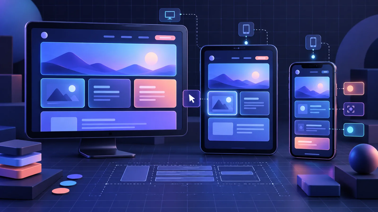
WordPress 7.1 introduced responsive block styles and standardized pseudo-states in Global Styles and theme.json. This is an important change for block theme developers: part of the responsive logic that previously lived in separate CSS can now be expressed through the WordPress style system.
This guide explains how @mobile, @tablet, :hover, :focus and :focus-visible work, where the new API stops, and how to adopt it without creating chaos in an established theme.
What changed in WordPress 7.1
Responsive styles can be defined at three levels:
- in
theme.jsonfor every block of a particular type; - through the Global Styles interface;
- on an individual block through its existing
styleattribute.
The base style acts as the desktop version. Values under @tablet and @mobile override only the properties they define. If the mobile state does not define a color, for example, the block continues to use its base color.
The feature applies to blocks using standard block supports such as typography, color, background, border, dimensions, spacing and layout. The official Responsive block styles and configurable viewports in WordPress 7.1 developer note provides the full technical background.
A basic responsive style example
Suppose a Group block needs generous padding on large screens and compact spacing on phones:
{
  "version": 3,
  "styles": {
    "blocks": {
      "core/group": {
        "spacing": {
          "padding": {
            "top": "3rem",
            "right": "3rem",
            "bottom": "3rem",
            "left": "3rem"
          }
        },
        "@mobile": {
          "spacing": {
            "padding": {
              "top": "1rem",
              "right": "1rem",
              "bottom": "1rem",
              "left": "1rem"
            }
          }
        }
      }
    }
  }
}
WordPress generates the media query and a stable class for the block. You do not need to duplicate the selector in style.css or manually keep editor styles in sync.
Configuring breakpoints
WordPress uses the following defaults:
@mobile: up to 480px;@tablet: above 480px and up to 782px.
A theme can provide its own values through the top-level settings.viewport property:
{
  "version": 3,
  "settings": {
    "viewport": {
      "mobile": "30rem",
      "tablet": "45rem"
    }
  }
}
Values must be non-negative numeric lengths using px, em or rem. Percentages, CSS functions and unitless values are ignored. There is no @desktop key: desktop is the base style.
Pseudo-states without separate CSS
WordPress 7.1 supports :hover, :focus, :focus-visible and :active directly inside the block style object. The user interface initially exposes these states for the Button and Navigation Link blocks.
{
  "styles": {
    "blocks": {
      "core/button": {
        "color": {
          "background": "var:preset|color|contrast",
          "text": "var:preset|color|base"
        },
        ":hover": {
          "color": {
            "background": "var:preset|color|accent-2"
          }
        },
        ":focus-visible": {
          "border": {
            "color": "var:preset|color|accent-1",
            "width": "2px"
          }
        }
      }
    }
  }
}
A pseudo-state can be nested inside a responsive state. For example, mobile hover styling can use a different contrast treatment from the base state:
"core/button": {
  "@mobile": {
    ":hover": {
      "color": {
        "background": "var:preset|color|contrast",
        "text": "var:preset|color|base"
      }
    }
  }
}
The full model is documented in the official Pseudo and custom style states in WordPress 7.1 developer note.
Styling the current navigation item
Navigation Link gained the -current custom state. It represents the link matching the current page and can contain a nested hover state:
"core/navigation-link": {
  "-current": {
    "color": {
      "text": "var:preset|color|contrast"
    },
    ":hover": {
      "color": {
        "text": "var:preset|color|accent-1"
      }
    }
  }
}
This can replace part of the theme-specific CSS targeting .current-menu-item and keeps the state inside the theme’s design system.
When to restrict the editor interface
On client sites, too many controls can cause accidental departures from the design system. WordPress lets you hide state editing without disabling the styles that are already saved:
add_filter( 'block_editor_settings_all', function ( $settings ) {
    $settings['blockStatesEditingEnabled'] = false;
    $settings['responsiveEditingEnabled']  = false;
    return $settings;
} );
The filter only removes controls from the interface. Styles stored in theme.json, Global Styles and block attributes continue to render.
A practical adoption workflow
- Audit the CSS. Locate media queries for typography, spacing, layout and button states.
- Move only systematic rules. Unique complex components do not automatically benefit from a
theme.jsonmigration. - Define breakpoints once. Avoid copying different values between CSS, JavaScript and JSON.
- Test the editor and frontend. Both environments should show the same spacing hierarchy and interactive states.
- Test keyboard navigation. Hover styling without a clear
:focus-visiblestate harms accessibility. - Validate the schema. Some responsive and pseudo-state schema validation was refined in Gutenberg 23.8 after WordPress 7.1 shipped.
Common mistakes
- creating an
@desktopkey instead of using the base style; - using percentages or
calc()insidesettings.viewport; - styling hover while forgetting focus and focus-visible;
- duplicating the same rule in CSS and
theme.json; - giving editors unrestricted state controls without editorial guardrails;
- testing only device preview instead of real browsers and touch devices.
Conclusion
The responsive and pseudo-state APIs in WordPress 7.1 do not replace CSS, but they move common design decisions into one coherent system. For block themes, that means less duplication, better editor-to-frontend parity and clearer rules for teams. Start with spacing, typography and buttons—the benefits are easiest to see there.
This article is current as of September 24, 2026.